
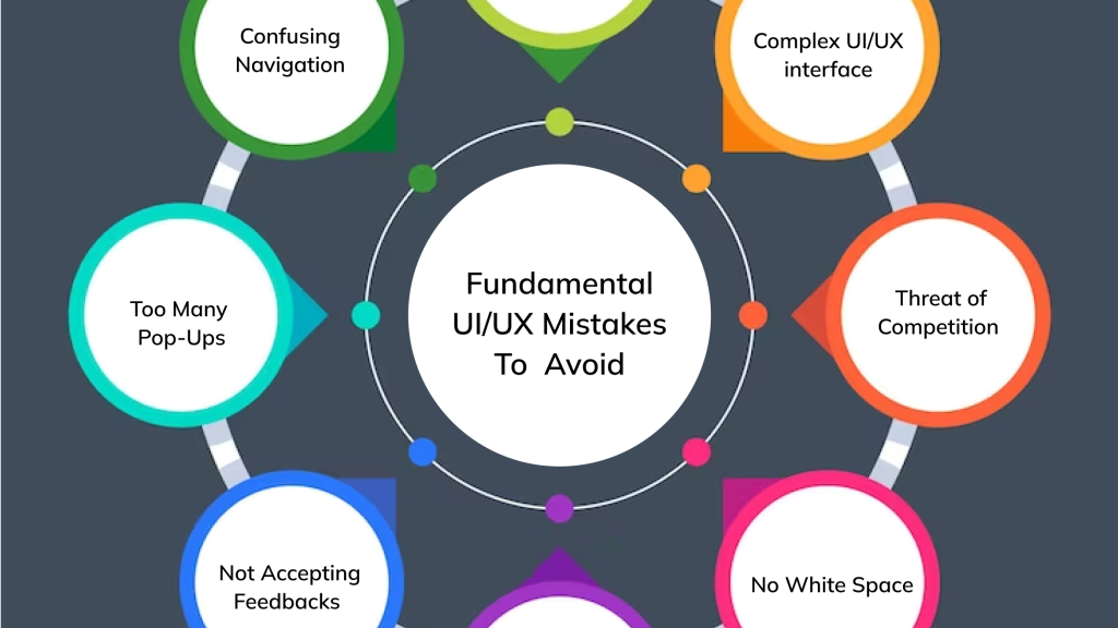
A good user interface can make a website or mobile app feel simple, attractive, and easy to use. When users visit a digital product, they should be able to understand what they see, find the information they need, and complete their tasks without unnecessary confusion. However, even a well-designed website can have small problems that make the experience frustrating.
UI, or user interface design, focuses on the visual and interactive elements people use when interacting with a digital product. This includes buttons, menus, colors, typography, icons, forms, and page layouts. When these elements are poorly designed, users may struggle to navigate a website or lose confidence in the product.
The good news is that many UI design mistakes can be fixed without rebuilding an entire website or app. Sometimes, adjusting spacing, improving readability, or making buttons more consistent is enough to create a noticeable improvement.
In this article, we will explore common UI design mistakes and practical ways to fix them.
1. Using Too Many Colors
Color plays an important role in UI design. It helps establish visual identity, highlight important elements, and guide users through a page. However, using too many colors can make an interface look cluttered and inconsistent.
When every button, heading, and section uses a different color, users may struggle to understand which elements are important. The design can also feel less professional.
How to fix it:
Create a simple color palette and use it consistently throughout your website or app. Choose a primary color for important actions, a few supporting colors, and neutral shades for backgrounds and text.
Use bright or contrasting colors when you want to draw attention to something important, such as a primary action button. Make sure text remains readable against its background, and do not rely on color alone to communicate errors or other important information.
A consistent color system helps create a cleaner interface and makes the overall design easier to understand.
2. Choosing Fonts That Are Difficult to Read
Typography affects how users read and understand information. Decorative fonts may look attractive in certain situations, but using them throughout a website can make the content difficult to read.
Text that is too small, tightly spaced, or displayed in long blocks can also discourage users from exploring a page.
How to fix it:
Choose readable fonts that suit your brand and work well across different screen sizes. Limit the number of font families you use and establish a consistent hierarchy for headings, subheadings, body text, and captions.
Give paragraphs enough line spacing and avoid using excessively long lines of text. Make sure the font size remains comfortable on mobile devices.
For most websites, a simple typography system is more effective than using several decorative fonts. The goal is to help visitors understand the content without unnecessary effort.
3. Creating a Cluttered Layout
A crowded interface can overwhelm users and make it difficult to identify the most important information. Too many buttons, banners, images, and text sections competing for attention can make a page feel confusing.
This often happens when designers try to include every possible feature on a single screen.
How to fix it:
Focus on the main purpose of each page and remove elements that do not support that goal. Group related information together and use whitespace to create separation between sections.
Whitespace does not necessarily mean leaving large empty areas. It simply refers to the space between design elements that helps users understand how content is organized.
Give important content room to stand out, and avoid adding decorative elements just because there is space available.
A cleaner layout makes information easier to scan and helps users focus on what matters.
4. Making Buttons Difficult to Identify
Buttons help users perform actions such as submitting a form, creating an account, making a purchase, or moving to another page. If buttons look like ordinary text or blend into the background, users may not realize they are interactive.
Inconsistent button styles can create a similar problem by making the interface feel unpredictable.
How to fix it:
Use clear visual styling to distinguish buttons from other elements. Primary actions should be easy to identify, while secondary actions can have a less prominent appearance.
Choose descriptive labels such as “Create Account,” “View Details,” or “Continue to Checkout” instead of vague wording when more specific language would help.
Maintain consistent button shapes, spacing, and typography across the interface. Also, provide visible interaction states, such as hover, focus, pressed, and disabled states, where appropriate.
Well-designed buttons help users understand what they can do and what will happen next.
5. Ignoring Mobile Responsiveness
A website may look excellent on a desktop screen but become difficult to use on a smartphone. Text may become too small, buttons may overlap, images may extend beyond the screen, or navigation menus may stop working properly.
Since people use a wide range of devices, a design that works only at one screen size can create a poor experience.
How to fix it:
Use responsive layouts that adapt to different screen sizes. Test your pages on mobile phones, tablets, and desktop screens rather than assuming that a desktop design will automatically work everywhere.
Make buttons easy to tap, keep text readable, and ensure that important content remains accessible without horizontal scrolling.
Review navigation menus, forms, images, and spacing at different viewport widths. A responsive design should feel intentional on every device, not simply like a smaller version of the desktop layout.
6. Using Inconsistent Spacing
Spacing might seem like a small detail, but it has a major influence on how organized an interface feels. When some elements are too close together and others have too much space between them, the design can appear unbalanced.
Inconsistent spacing can also make it harder for users to recognize which pieces of information belong together.
How to fix it:
Establish a spacing system and apply it consistently. For example, you might use a base spacing scale with increments such as 4, 8, 12, 16, 24, and 32 pixels, adjusting the values to suit your design.
Keep related elements close together and use larger gaps to separate different sections. Apply consistent padding inside cards, around buttons, and between form fields.
You do not need to use the same spacing everywhere. The important thing is to make spacing purposeful and predictable.
A consistent spacing system creates visual balance and makes interfaces easier to scan.
7. Making Navigation Confusing
Navigation should help users understand where they are and how to reach other parts of a website or app. When menu labels are unclear, important links are hidden, or too many options are presented at once, users may struggle to find what they need.
A confusing navigation system can be especially frustrating for first-time visitors.
How to fix it:
Organize navigation around the tasks users are most likely to perform. Use familiar labels such as “Home,” “Products,” “Services,” “About,” and “Contact” when they accurately describe the destination.
Group related pages into logical categories and keep the most important links easy to access. For larger websites, search and well-organized dropdown menus may also be helpful.
Avoid creating too many navigation levels unless they are genuinely necessary. Test the structure with real users to see whether they can find important pages without assistance.
Good navigation should feel natural rather than requiring users to figure out how the website works.
8. Using Icons Without Clear Meaning
Icons can make interfaces more compact and visually appealing. However, not every icon is immediately understandable, especially when it represents an unfamiliar action.
For example, an unusual symbol might be intended to represent settings, sharing, or saving, but users may interpret it differently.
How to fix it:
Use familiar, recognizable icons whenever possible. When an icon’s meaning may not be obvious, pair it with a short text label.
Keep icon styles consistent in terms of line weight, size, and visual treatment. Make interactive icons large enough to select comfortably, particularly on touchscreens.
Provide accessible names for icon-only controls so people using screen readers can understand their purpose. Tooltips can also help explain less familiar actions.
Icons should make the interface easier to use, not force users to guess what a symbol means.
9. Forgetting About Accessibility
An interface can look visually impressive and still be difficult for some people to use. Poor color contrast, missing form labels, tiny interactive targets, and keyboard navigation problems can prevent users from accessing important features.
Accessibility is not an optional finishing touch. It is an essential part of creating a usable digital product.
How to fix it:
Use sufficient contrast between text and its background. Provide clear labels for form fields, meaningful alternative text for informative images, and visible keyboard focus indicators.
Make sure interactive elements can be operated without a mouse and that headings follow a logical structure. Avoid using color as the only way to communicate important information.
It is also helpful to test your interface with a keyboard and accessibility tools. Automated checks can identify some problems, while manual testing can reveal issues that automated tools miss.
Accessible design helps more people use your product comfortably and often improves usability for everyone.
10. Providing Poor Error Messages
Errors can occur when users enter incorrect information, lose their internet connection, or attempt an action that cannot be completed. If the interface responds with a vague message, users may not understand what went wrong.
Messages such as “Something failed” or “Invalid input” provide little guidance when presented without additional context.
How to fix it:
Write error messages that explain the problem in clear, simple language and tell users how to resolve it whenever possible.
For example, instead of saying “Invalid email,” explain that the email address appears to be incomplete and ask the user to check its format.
Display errors near the relevant field or action, and use both text and visual indicators to make them noticeable. Preserve information the user has already entered whenever possible.
A helpful error message should guide users toward a solution rather than leave them wondering what to do next.
11. Adding Too Many Animations and Effects
Animations can make an interface feel responsive and engaging. Small transitions can help users understand when a menu opens, a button is pressed, or a panel appears.
However, excessive animation, bouncing elements, and elaborate transitions can distract users and make the interface feel slow.
How to fix it:
Use animation only when it serves a purpose. Simple transitions can provide feedback or help users understand changes in the interface.
Keep animations brief and avoid unnecessary movement that competes with important content. Make sure essential information is not hidden behind effects that take too long to finish.
Respect reduced-motion preferences where supported, especially for users who may experience discomfort from excessive movement.
The best animations often go unnoticed because they make the experience feel smoother without demanding extra attention.
12. Making Forms Too Complicated
Forms are essential for tasks such as account creation, checkout, booking, and contacting a business. Yet a poorly designed form can turn a simple task into a frustrating experience.
Too many fields, unclear labels, confusing validation rules, and missing instructions can cause users to abandon the process.
How to fix it:
Ask only for information that is genuinely necessary. Use clear labels, provide helpful examples where needed, and group related fields together.
Choose suitable input types for information such as email addresses and telephone numbers. Where appropriate, support autofill and explain required fields before users submit the form.
For longer forms, consider dividing the process into manageable steps and showing users their progress.
Make sure the form works well on mobile devices and clearly indicates whether submission was successful.
A straightforward form reduces effort and helps users complete important tasks with confidence.
13. Ignoring Loading and Empty States
Designers often focus on how an interface looks when all the content is available. However, users may also encounter loading screens, empty search results, or pages with no saved information.
If these states are not designed carefully, an interface can appear broken or leave users unsure about what to do.
How to fix it:
Provide appropriate feedback while content loads. For longer operations, a progress indicator or a clear status message can help users understand that the system is working.
When a list is empty, explain why and offer a useful next step. For example, a task app with no existing tasks might display a message encouraging users to create their first task.
If a search produces no results, suggest changing the search terms or removing filters.
Thoughtful loading and empty states make the product feel more complete and prevent unnecessary confusion.
14. Failing to Maintain Design Consistency
A website or app may contain individually attractive elements but still feel unprofessional when those elements do not work together. Different button styles, heading sizes, colors, and form layouts can make the interface feel inconsistent.
This problem often appears as a product grows and different pages are designed at different times.
How to fix it:
Create a basic design system that defines reusable colors, typography, spacing, buttons, form fields, icons, and other common components.
Use shared components where possible so that the same element behaves and looks consistently across different screens.
Document important design decisions and review new pages against the existing system. Consistency does not mean every page must look identical; it means users should not have to relearn familiar interactions.
A well-maintained design system makes the product easier to use and can also help teams design and develop new features more efficiently.
15. Designing Without User Feedback
One of the most common UI design mistakes is making decisions based entirely on personal preferences. A designer may believe a layout is clear, but actual users may struggle to understand it.
Without feedback, small usability problems can remain hidden until they begin affecting customer satisfaction or business results.
How to fix it:
Test your interface with people who represent your intended audience. Ask them to complete common tasks, such as finding a product, submitting a form, or changing an account setting.
Observe where they hesitate, make mistakes, or ask for help. These moments can reveal opportunities for improvement.
You can also review analytics, customer support requests, and user feedback to identify recurring problems.
Start with the most important issues, make targeted changes, and test again. You do not need a large research budget to learn useful lessons from real users.
Conclusion
Good UI design is not only about creating something that looks attractive. It is about making digital products clear, consistent, accessible, and easy to use.
Common mistakes such as cluttered layouts, confusing navigation, poor typography, inconsistent spacing, and unclear error messages can make even a useful product frustrating. Fortunately, these problems can often be addressed through small, thoughtful improvements.
Start by reviewing your interface from the user’s point of view. Look for places where people might hesitate, struggle to understand an element, or need unnecessary effort to complete a task.
Focus on the changes that will have the greatest impact, test them with real users, and continue improving based on what you learn.
Remember that effective UI design is an ongoing process. By paying attention to small details and keeping usability at the center of your decisions, you can create a more polished, accessible, and enjoyable experience for everyone who uses your product.