
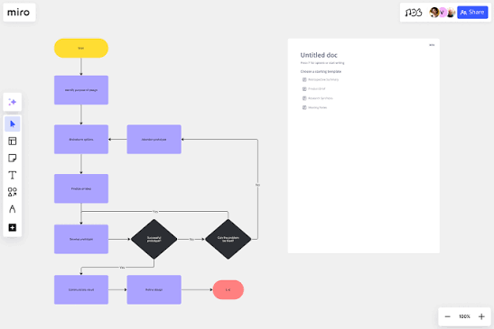
Creating a successful digital product involves much more than designing attractive screens or choosing the right colors. Behind every useful website, mobile app, or digital service is a process of understanding users, identifying problems, exploring solutions, and testing ideas before turning them into a finished product.
This process is known as product design. It brings together research, strategy, user experience (UX), user interface (UI), and collaboration to create products that solve real problems and meet people’s needs.
Whether you are designing a new mobile application, improving an existing website, or developing a digital service for a business, following a structured design process can help you make better decisions and avoid unnecessary work.
In this practical guide, we will walk through the main stages of product design, from the first user research session to the final design ready for development.
1. Start by Understanding the Problem
Before opening a design tool or creating wireframes, take time to understand the problem you are trying to solve. It is easy to jump straight into designing features, but a visually appealing solution will not be very useful if it does not address the right problem.
For example, imagine an online store where many customers leave before completing their purchases. The immediate reaction might be to redesign the checkout page. However, the real issue could be unexpected shipping costs, a complicated payment process, or a lack of trust in the website.
Understanding the problem first helps prevent teams from spending time on solutions that do not address users’ actual needs.
What you should do:
- Identify the business goal behind the project.
- Understand who the intended users are.
- Review existing customer feedback and product performance.
- Define the problem clearly before discussing solutions.
- Agree on what a successful outcome should look like.
A useful problem statement might be: “Customers are abandoning checkout because they find the payment process confusing.”
A clear problem statement gives the design team a direction and helps everyone stay focused on the same goal.
2. Conduct User Research
User research is one of the most important stages of product design. It helps you understand how people behave, what they need, what frustrates them, and what they expect from a product.
Instead of making decisions based entirely on assumptions, research provides evidence that can guide the design process.
There are several ways to collect useful information, depending on the project and available resources.
Common user research methods
- User interviews: Talk directly with potential or existing users about their experiences, needs, and challenges.
- Surveys: Collect feedback from a larger group of people to identify common preferences or problems.
- Usability testing: Observe people using an existing product to discover where they struggle.
- Analytics review: Examine product data to understand how users navigate pages and where they abandon tasks.
- Competitor analysis: Study similar products to understand common patterns, strengths, and weaknesses.
For example, if you are designing a fitness app, interviews might reveal that users struggle to maintain a workout routine because existing apps feel complicated or require too much daily effort.
That insight could influence the product’s onboarding process, workout recommendations, and progress-tracking features.
The key is to ask open-ended questions and listen carefully. Avoid asking questions that encourage people to agree with your preferred solution.
3. Identify User Needs and Pain Points
After collecting research data, the next step is to organize the findings and identify the most important problems.
You may discover several issues, but not all of them will have the same impact. Some problems affect only a small number of users, while others prevent people from completing essential tasks.
Look for recurring patterns across interviews, surveys, observations, and analytics.
For example, users might repeatedly mention that they cannot find the search function, do not understand the pricing structure, or have difficulty completing registration.
You can organize these findings into categories such as usability problems, unmet needs, accessibility barriers, and opportunities for improvement.
Create a user persona
A user persona is a research-informed representation of an important user group. It helps the team remember who they are designing for and what those users need.
A simple persona might include:
- Goals and motivations.
- Common frustrations.
- Relevant behaviors.
- Experience with similar products.
- Tasks the person wants to complete.
Personas should be based on actual research rather than invented assumptions about an ideal customer.
You can also use a user journey map to visualize the steps someone takes when interacting with a product. This can reveal moments of confusion or frustration that are easy to overlook when examining individual screens.
The goal is to turn research findings into clear design opportunities.
4. Define the Product Requirements
Once you understand the problem and user needs, translate those findings into product requirements.
At this stage, you decide what the product needs to do and which features are most important. This helps prevent the project from becoming overloaded with ideas that do not contribute to its main purpose.
Start by identifying the essential tasks users must be able to complete.
For a food delivery app, these might include browsing restaurants, viewing menus, adding items to a cart, placing an order, and tracking delivery.
Additional features, such as personalized recommendations or advanced loyalty programs, may be useful but are not necessarily essential for the first release.
How to prioritize features:
- Focus first on features that solve the main user problem.
- Consider the value each feature provides to users.
- Evaluate technical complexity and development effort.
- Identify accessibility, security, and reliability requirements.
- Separate essential functionality from optional improvements.
A prioritization framework such as MoSCoW can help teams classify requirements as Must have, Should have, Could have, or Won’t have for the current release.
Clear requirements give designers and developers a shared understanding of what needs to be built.
5. Create User Flows and Information Architecture
Before designing individual screens, plan how users will move through the product.
A user flow shows the steps someone takes to complete a specific task. Information architecture organizes the product’s content, pages, and navigation so users can find what they need.
These two elements help establish the structure of the experience before visual design begins.
For example, the checkout flow of an online store might look like this:
<box border radius=”xl” padding={3} gap={2} align=”center”> <box background=”surface-secondary” radius=”md” padding={3} width=”100%” align=”center”> Product Page <text color=”secondary” size=”sm”>Review product details</text> </box> <icon name=”arrow-down” size=”lg” color=”secondary”/> <box background=”surface-secondary” radius=”md” padding={3} width=”100%” align=”center”> Shopping Cart <text color=”secondary” size=”sm”>Check items and quantities</text> </box> <icon name=”arrow-down” size=”lg” color=”secondary”/> <box background=”surface-secondary” radius=”md” padding={3} width=”100%” align=”center”> Checkout <text color=”secondary” size=”sm”>Enter delivery and payment details</text> </box> <icon name=”arrow-down” size=”lg” color=”secondary”/> <box background=”surface” border radius=”md” padding={3} width=”100%” align=”center”> <icon name=”check-circle” size=”lg” color=”success”/> Order Confirmation <text color=”secondary” size=”sm”>Confirm the purchase and next steps</text> </box> </box>
Mapping the flow makes it easier to identify unnecessary steps, missing information, and potential points of confusion.
Keep the user’s main goal in mind when planning each step. A good flow should help people complete tasks without forcing them through unnecessary screens.
6. Sketch Ideas and Build Wireframes
Once the structure is clear, begin exploring possible layouts.
Wireframes are simplified representations of a product’s screens. They focus on the placement of elements, content hierarchy, navigation, and functionality rather than polished colors or detailed visuals.
You can create wireframes using a digital design tool or even sketch them on paper.
At this stage, focus on questions such as:
- Where should the main navigation appear?
- What information should users see first?
- Which actions need to be most prominent?
- How should related information be grouped?
- What happens when users make a mistake?
For example, a dashboard might need to display account information, recent activity, important notifications, and a primary action. Wireframes help you explore how to organize these elements before investing time in detailed design.
Do not worry about making early sketches perfect. Their purpose is to help you think through different solutions quickly and compare alternatives.
Making changes to a wireframe is usually much easier than rebuilding a fully designed interface.
7. Build an Interactive Prototype
A prototype turns static wireframes or visual designs into an experience that people can interact with.
It allows users and stakeholders to click buttons, navigate between screens, and experience important workflows before the product is developed.
Prototypes can range from simple clickable wireframes to high-fidelity simulations that closely resemble the finished product.
For example, a prototype of a booking app might let users select a service, choose an available time, enter their details, and reach a confirmation screen.
This makes it easier to test whether the flow is understandable and whether important interactions work as expected.
Popular tools such as Figma can help designers create interactive prototypes without building a fully functional application.
Remember that a prototype does not need to simulate every feature. Focus on the key tasks and uncertain parts of the experience that you need to evaluate.
8. Test the Design With Real Users
Usability testing helps determine whether your design actually works for the people it is intended to serve.
Even if a design seems clear to the team, users may interpret labels differently, overlook important buttons, or struggle with a particular step.
Testing allows you to identify these problems before development makes them more expensive to fix.
How to conduct a simple usability test
- Choose a few important tasks users should be able to complete.
- Recruit people who reasonably represent your intended audience.
- Ask them to complete each task using your prototype.
- Observe their behavior without immediately explaining what to do.
- Record confusion, hesitation, errors, and questions.
- Use the findings to improve the design.
For example, you might ask someone to find a product, add it to their cart, and proceed to checkout.
If the person repeatedly overlooks the cart icon, you may need to improve its visibility or placement.
You do not always need a large group to discover major usability problems. A small, well-planned test can reveal valuable issues, although larger or more diverse studies may be necessary for broader conclusions.
The important part is to test with real people and use what you learn to improve the experience.
9. Develop the Visual UI Design
After validating the main structure and interactions, you can move into detailed visual design.
This stage gives the product its visual identity through colors, typography, icons, imagery, spacing, and component styles.
However, visual design should support usability rather than compete with it. A beautiful interface is not successful if users cannot read the content or understand how to interact with it.
Important visual design principles
- Visual hierarchy: Make important information and actions easy to notice.
- Consistency: Use a consistent system for colors, typography, buttons, and spacing.
- Readability: Choose appropriate font sizes and maintain sufficient contrast.
- Responsive design: Make the interface work across different screen sizes.
- Accessibility: Consider keyboard navigation, screen readers, and other access needs.
Create reusable components for common elements such as buttons, form fields, navigation bars, and cards. A simple design system helps maintain consistency across the product and makes future updates easier.
Also, include different interface states, such as loading, empty, error, success, hover, and disabled states. These details are important for creating a complete experience rather than designing only the ideal screen.
10. Collaborate With Developers During Handoff
A finished design still needs to be implemented correctly. The handoff between designers and developers is an important stage because missing details can lead to inconsistencies or unnecessary rework.
Designers should communicate how components behave, how layouts adapt to different screen sizes, and what happens in less common situations.
A useful design handoff may include:
- Final screen designs and prototypes.
- Reusable component specifications.
- Typography, colors, spacing, and layout guidelines.
- Interaction behavior and transition details.
- Responsive layout expectations.
- Loading, error, empty, and success states.
- Relevant accessibility requirements and assets.
It is also helpful to involve developers earlier in the process rather than waiting until every design decision is final.
Early collaboration can reveal technical limitations, simplify complex interactions, and help the team find practical solutions without sacrificing the user experience.
Good handoff is not just about sharing files. It is about ensuring everyone understands the intended behavior and purpose of the design.
11. Review the Implemented Product
Once development is complete, compare the actual product with the approved designs.
Even with clear specifications, differences can appear during implementation. A button may be misplaced, text may wrap unexpectedly, or an interaction may behave differently from what the prototype showed.
A design review helps identify these issues before the product is released.
Test the product on different devices and screen sizes. Check important user flows, form validation, navigation, responsiveness, accessibility, and visual consistency.
Where possible, work with developers to fix issues directly rather than treating the design handoff as the end of the designer’s responsibility.
Pay particular attention to critical tasks such as account creation, checkout, booking, and payment. Problems in these areas can have a significant effect on both users and the business.
The final design should be evaluated as a working product, not just as a collection of attractive screens.
12. Measure Results and Keep Improving
Product design does not end when a product launches. Real users may behave differently from what research and testing predicted, so continued evaluation is essential.
After release, monitor whether the design is helping users complete their tasks and whether it is meeting the project’s goals.
Useful measurements may include:
- Task completion rates.
- Time needed to complete important tasks.
- Form abandonment rates.
- User satisfaction and feedback.
- Conversion rates for relevant business goals.
- Support requests related to usability issues.
Choose metrics that relate directly to the problem you originally identified. For example, if the project aimed to simplify checkout, monitor checkout completion and abandonment rather than focusing only on general website traffic.
Combine quantitative data with qualitative feedback. Analytics can show where users leave a process, while interviews and usability tests can help explain why.
Use these findings to identify the next improvement, test it, and repeat the process.
A successful product evolves as user needs, technology, and business priorities change.
A Practical Product Design Workflow at a Glance
The product design process can be summarized into eight main stages.
<box border radius=”xl” padding={3} gap={3}> <row align=”start” gap={3}> <box background=”surface-secondary” radius=”lg” size=”42px” align=”center” justify=”center”> <icon name=”search” size=”xl”/> </box> <box flex=”1″ gap={1}> 1. Research <text color=”secondary” size=”sm”>Understand users, their goals, and the problems they face.</text> </box> </row> <divider color=”subtle”/> <row align=”start” gap={3}> <box background=”surface-secondary” radius=”lg” size=”42px” align=”center” justify=”center”> <icon name=”target” size=”xl”/> </box> <box flex=”1″ gap={1}> 2. Define <text color=”secondary” size=”sm”>Turn research findings into clear problems and product requirements.</text> </box> </row> <divider color=”subtle”/> <row align=”start” gap={3}> <box background=”surface-secondary” radius=”lg” size=”42px” align=”center” justify=”center”> <icon name=”git-branch” size=”xl”/> </box> <box flex=”1″ gap={1}> 3. Plan <text color=”secondary” size=”sm”>Map user flows and organize information and navigation.</text> </box> </row> <divider color=”subtle”/> <row align=”start” gap={3}> <box background=”surface-secondary” radius=”lg” size=”42px” align=”center” justify=”center”> <icon name=”pencil-ruler” size=”xl”/> </box> <box flex=”1″ gap={1}> 4. Wireframe <text color=”secondary” size=”sm”>Explore layouts and organize important interface elements.</text> </box> </row> <divider color=”subtle”/> <row align=”start” gap={3}> <box background=”surface-secondary” radius=”lg” size=”42px” align=”center” justify=”center”> <icon name=”mouse-pointer-click” size=”xl”/> </box> <box flex=”1″ gap={1}> 5. Prototype and test <text color=”secondary” size=”sm”>Simulate key interactions and validate the experience with users.</text> </box> </row> <divider color=”subtle”/> <row align=”start” gap={3}> <box background=”surface-secondary” radius=”lg” size=”42px” align=”center” justify=”center”> <icon name=”palette” size=”xl”/> </box> <box flex=”1″ gap={1}> 6. Design <text color=”secondary” size=”sm”>Create polished screens, reusable components, and interaction states.</text> </box> </row> <divider color=”subtle”/> <row align=”start” gap={3}> <box background=”surface-secondary” radius=”lg” size=”42px” align=”center” justify=”center”> <icon name=”code-2″ size=”xl”/> </box> <box flex=”1″ gap={1}> 7. Handoff and review <text color=”secondary” size=”sm”>Collaborate with developers and check the implemented product.</text> </box> </row> <divider color=”subtle”/> <row align=”start” gap={3}> <box background=”surface-secondary” radius=”lg” size=”42px” align=”center” justify=”center”> <icon name=”chart-no-axes-combined” size=”xl”/> </box> <box flex=”1″ gap={1}> 8. Measure and improve <text color=”secondary” size=”sm”>Evaluate results, learn from real usage, and refine the product.</text> </box> </row> </box>
These stages provide a useful starting point, but product design is rarely a perfectly straight line. Testing may reveal a problem that requires revisiting the user flow or conducting additional research. That is a normal part of the process.
Conclusion
Designing a successful product requires more than creating attractive interfaces. It involves understanding people, defining the right problems, exploring possible solutions, and validating decisions before and after development.
Starting with user research helps ensure that the product addresses real needs. Clear requirements, thoughtful user flows, and wireframes provide a strong foundation. Prototypes and usability testing reveal problems early, while visual design and effective developer collaboration help turn validated ideas into a working product.
Once the product is launched, measurement and feedback provide opportunities to continue improving the experience.
The most important lesson is to keep users involved throughout the process. Rather than relying entirely on assumptions, use research, testing, and real-world results to guide your decisions.
Whether you are working on a small website or a complex digital platform, a structured and user-focused approach can help you create products that are useful, accessible, and enjoyable to use. Great product design is not about getting every detail right on the first attempt. It is about learning, improving, and consistently solving the right problems for the people who use your product.